UX DESIGN
SENIOR PRODUCT DESIGNER
multi-year project
B2B ENTERPRISE SAAS
Designing a Client Self-Service Platform for complex Administrative Workflows
A multi-year initiative to give enterprise HR and benefits clients direct control over their own platforms, replacing a supporting-ticket model with tools that made complex, rules-based configuration approachable for non-expert users.
4 -> 40
Tools built as the platform scaled
~10
Tools personally designed end-to-end
2
Tools built as the platform scaled
Tickets Replaced
Tickets that once required a support request are now self-service
PROBLEM
Clients had no direct control over their own platforms
THE SITUATION
The company provided benefits administration platforms to large enterprise clients, but even minor updates required clients to contact an internal team, open a support ticket, and wait. The process was slow, prone to miscommunication, and frustrating for clients who needed to respond quickly to changing organizational needs. It also created a significant operational burden internally and contributed to high call center volume.
THE SITUATION
The underlying capabilities already existed, built for internal teams with deep system knowledge. Simply giving clients access was not going to work. The workflows needed to be rethought from the ground up to be understandable, forgiving, and trustworthy for non-expert users.
THE OPPORTUNITY
Design tools that gave clients genuine confidence to act independently. Not by hiding complexity, but by making it legible. Each tool needed to help users understand what they were configuring and what it would affect, without watering down the functionality underneath.
GOALS
Four priorities that shaped every tool
Each tool started with a requirements walkthrough covering what it needed to do, how existing workflows were functioning, and where the pain points were. Weekly reviews with product and development stakeholders kept decisions grounded in both user needs and technical reality
01
Reduce reliance on internal support
Give clients the ability to complete common administrative tasks on their own, so that getting something done did not require opening a ticket and waiting for an internal team to act.
02
Make complex configuration approachable
Break down multi-step, rules-based processes into interactions that helped users understand what they were configuring and what it would affect, without simplifying away the functionality they needed.
03
Prevent errors without removing flexibility
Build in validation, guardrails, and clear system feedback so clients could work confidently in high-stakes workflows without needing expert knowledge to avoid costly mistakes.
04
Build something that scaled consistenly
Establish shared patterns that made each new tool feel familiar, so the platform could grow from a handful of tools to dozens without becoming harder to navigate or learn
Approach
How the work actually got done
Building consistency without a formal system
When the platform launched, there were four tools and a company-wide design system that was still maturing. Many components we needed did not exist yet, and there was no playbook for how the platform should look, feel, or behave. Each designer owned their tool end-to-end, but we met weekly to share what was working, surface point points, and align on patterns so the tools felt cohesive even while being built in parallel
As the platform grew, informal alignment was not enough. I pushed for creating a shared documentation file that captured the common patterns, interactions, and conventions that would define the platform. Not a formal design system, but a working reference that kept decisions visible and consistent as new tools were added and new designers joined. By the time the platform reached roughly 40 tools, the consistency was intentional, not accidental.
Making complex configuration understandable
Many of the workflows I designed involved multi-step, rules-based configuration with dependencies that could cause real problems if misunderstood. My approach was to use clear information hierarchy, progressive disclosure, and inline guidance so users could reason about eligibility rules, visibility settings, and system outcomes as they worked, rather than being confronted with everything at once.
Contributing back to the broader design system
Several components the platform needed did not exist in the company’s design system. Rather than building one-off solutions, I identified patterns worth contributing back. I personally led the design and delivery of a date picker and an upload component, writing documentation, presenting to the design system council, running accessibility reviews, and working directly with developers on interaction requirements and edge cases. Both were adopted into the broader system, extending their value well beyond the tooling platform.
DESIGN DECISIONS
Three patterns that defined the platform experience
Across ten tools, a set of consistent decisions emerged that reduced relearning, surfaced complexity at the right moment, and gave clients the confidence to act without support.
PATTERN 01
Shared patterns that reduced relearning
Shared table structures with advanced search gave users a familiar way to manage data across tools. Horizontal tabs organized complex functionality while keeping a predictable structure platform-wide. Keeping primary actions in consistent locations meant users always knew where to start, regardless of which tool they were in.
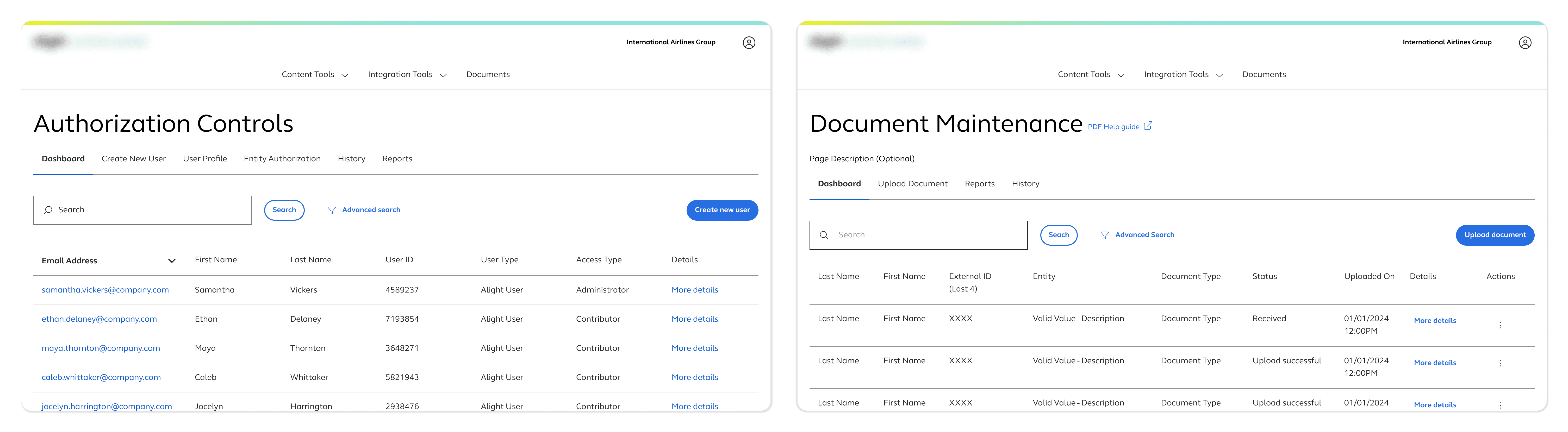
Tools featured a shared table structure, advanced search, horizontal tabs, and primary actions in consistent locations
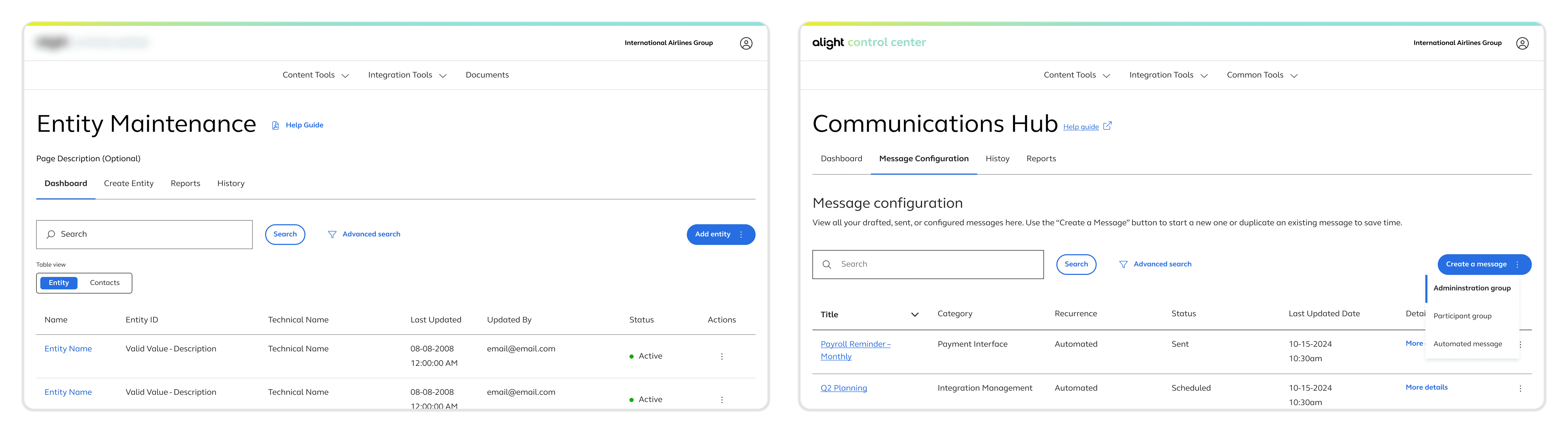
A tab button lets the user switch between table views & a dropdown menu lets the user select the type of message. The design allowed for features to be added when complexity required it but the overall structure remained the same.
PATTERN 02
Stepping through complexity
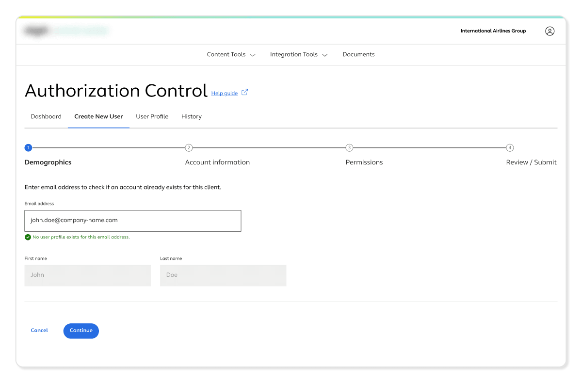
For longer, rules-based configuration flows, a stepper pattern broke the process into understandable stages and helped users orient themselves within a complex task. Related inputs and guidance were grouped into subsections so users could process information incrementally.
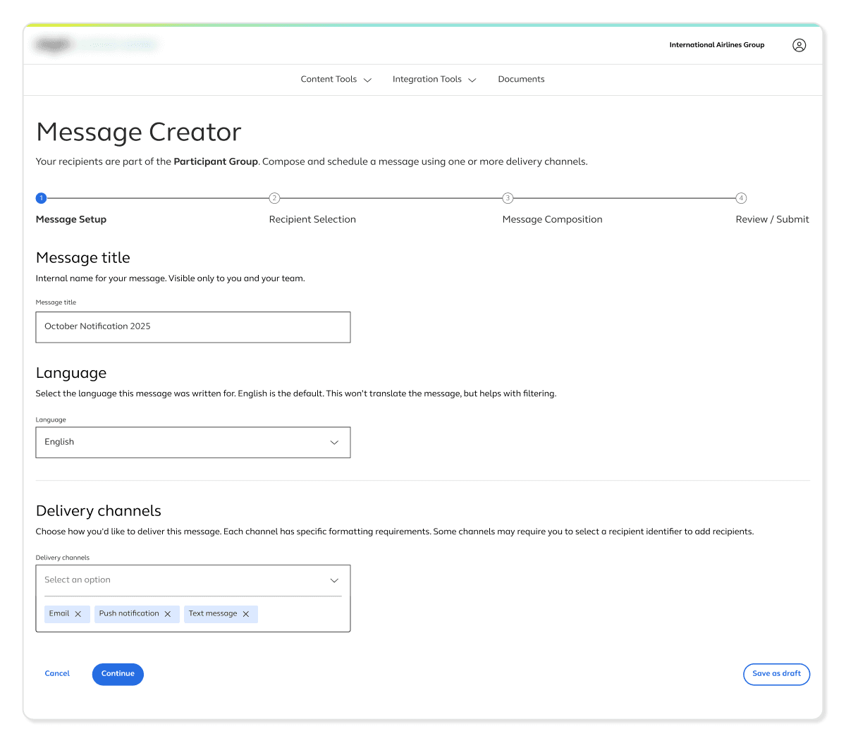
Stepper creation flow used to help focus and orient users during more complex creation flows
For tools with simpler configuration flows, a single-page view is used to avoid adding complexity when it wasn’t needed. The pattern needed to match the task, not the other way around.
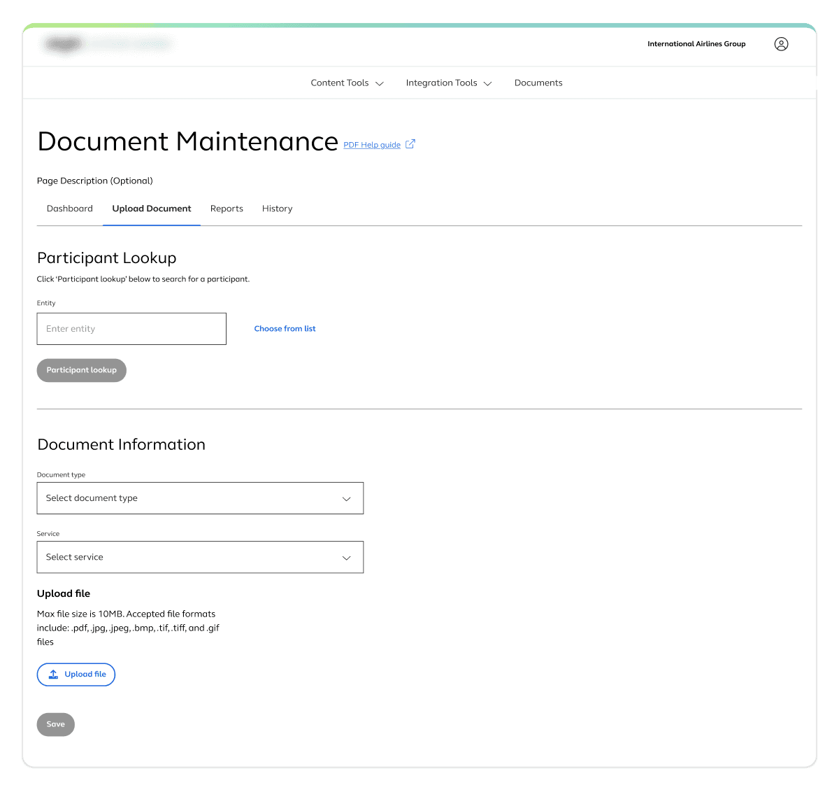
Single page creation flow
PATTERN 03
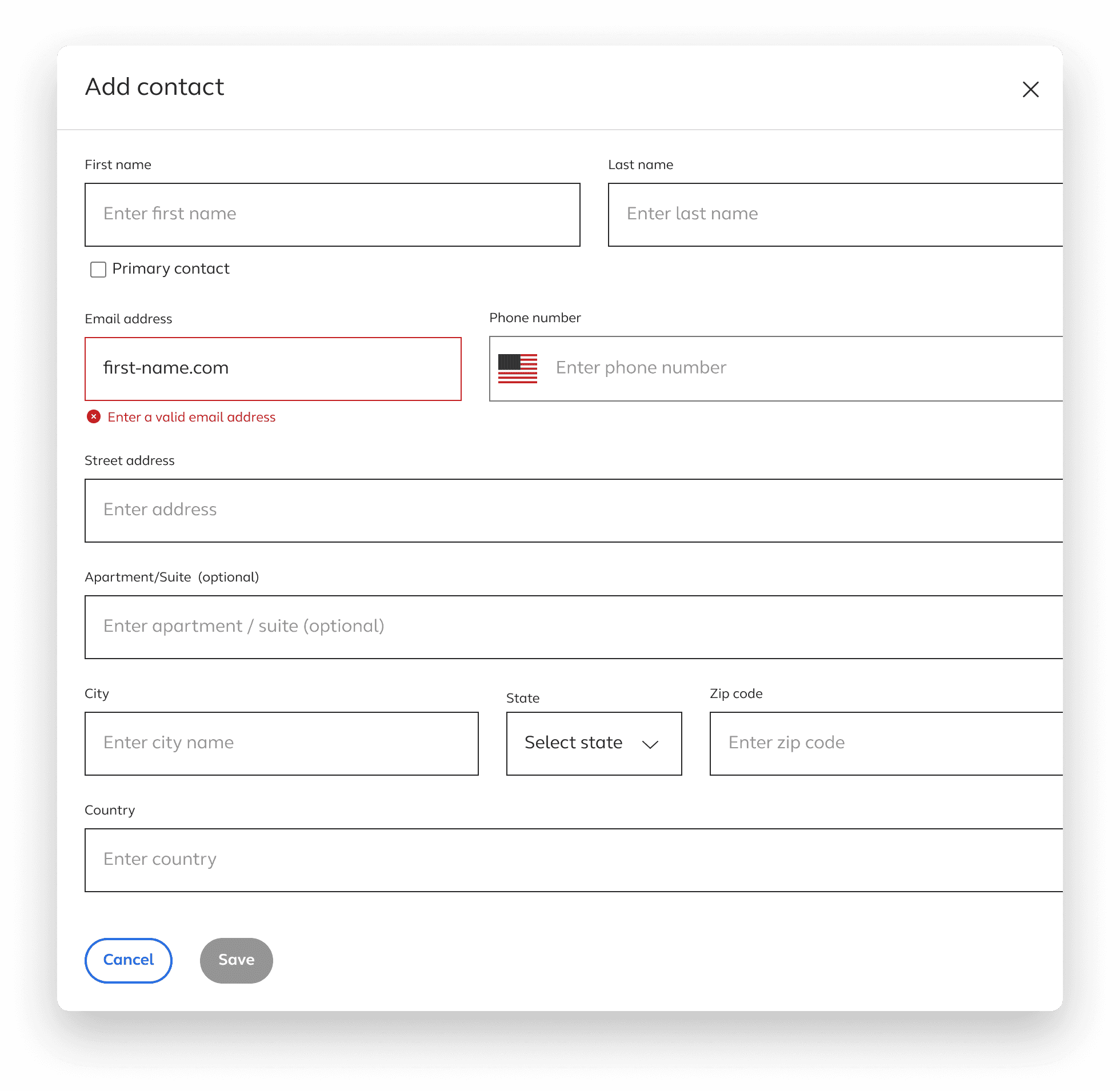
Guardrails that support autonomy, not limit it
Inline validation surfaced issues at the point of interaction so users could fix mistakes immediately without losing context.
Inline success message
Inline error message

Upload component states
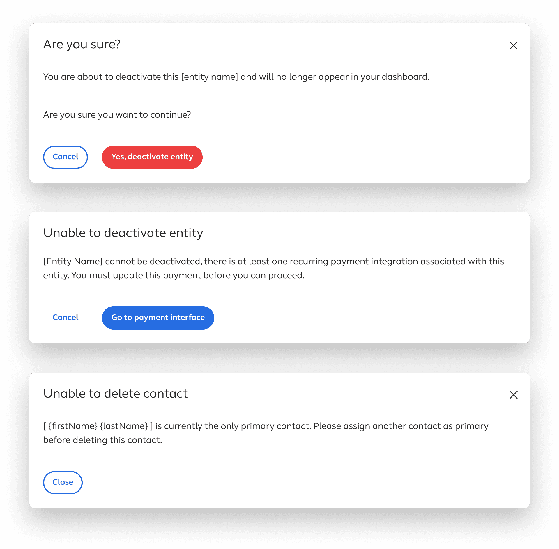
An exit warning modal protected users from accidentally losing work.
Upload component states
A final review state before committing changes gave users a clear picture of exactly what they were about to do, which was especially important in high-risk workflows where a misconfiguration could have downstream consequences.
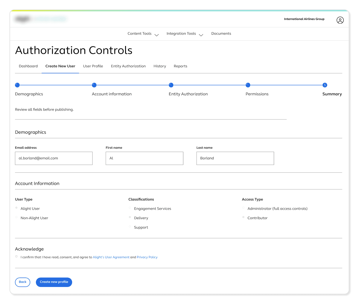
Final step in the creation process lets you review before completing
OUTCOMES
A platform that kept earning investment
The clearest signal that the platform was working was that it kept growing. What started as four tools expanded to roughly forty over the course of the project, with continued investment in building out new capabilities. Clients were moving from a model where even small changes required a support request, toward one where they had direct, confident control over a meaningful part of their own experience.
4 to 40
Platform growth as a signal of confidence
The platform’s expansion from four tools to forty, adopted across both private and public sector enterprise clients with complex compliance requirements, reflected sustained organizational confidence in what was being built.
Self-serve
Support dependency replaced with direct ownership
Tasks that previously required opening a support ticket and waiting for an internal team became things clients could complete on their own, on their own timeline. The tools shifted the model from reactive support to proactive client control.
2 Shipped
Components contributed to the design system
A date picker and upload component I designed and documented were adopted into the company’s broader design system, extending their value across product surfaces well beyond the tooling platform.
Consolidated
Third-party tools replaced
Several of the tools I designed replaced existing third-party applications, consolidating workflows into the platform and reducing external dependencies for clients.
OUTCOMES
A platform that kept earning investment
ON COMPLEXITY
Hiding complexity is not the same as solving it
The instinct when designing for non-expert users is to simplify by removing. What worked here was making complexity legible instead. When users could see what they were configuring and understand the downstream effects, they were more willing to act independently, not less.
ON CONSISTENCY
Consistency has to be maintained deliberately, especially as teams grow
Early on, alignment happened through conversation. As the platform scaled to 40 tools and more designers joined, that stopped being enough. Pushing for a shared documentation file was one of the more impactful things I did on this project, not because it was glamorous work, but because it meant every tool that came after benefited from decisions that had already been worked through.
ON HANDOFF
The handoff is part of the design
Having a dedicated meeting for developers to ask questions and get clarification after handoff changed the quality of what got built. Design decisions that might have been quietly interpreted away go discussed and resolved. The work does not end when the file gets handed over.
ON GUARDRAILS
Guardrails make users more confident, not more cautious
Validation, previews, and confirmation states did not limit what clients could do. They made clients more willing to do it. Knowing the system would catch mistakes before they became problems gave users the confidence to move forward rather than second-guess every decision.
OTHER PROJECTS